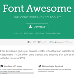
If you are like me you may have heard of “Font Awesome” vector icons and decided you were too busy to look into it further. That’s really a shame, because I wish I wasn’t so “late to the party” on this advancement in #webdev.
What It Is
 Font Awesome is a vector based set of icons accessed through CSS. The reason vector is import to us in the web world is that a vector image can be scaled up or down without any loss of clarity, unlike bitmap (continuous tone) images. This versatility compared to continuous tone images is also a profound benefit to print design work.
It first came across my eyeballs as part of Twitter Bootstrap, but I didn’t have the time to drill down into what it was… or…
Why It Is… Awesome
Pros
The day I finally got “on board”, I spent some time cleaning up compression artifacts in one of the social media icons I used for Twitter. This is not fun. At that moment I realized the images also wouldn’t scale well in a responsive page, and a light bulb icon went off over my head, reminding me of Font Awesome.
Let’s not forget: open source; completely free.
Cons
The drawback for any assets that use a CDN (content delivery network) is that lag could be introduced when fetching your content. I saw this a lot with a Yahoo Weather service I was using frequently that would not execute at all sometimes. For sites with low-to-moderate traffic, this may not be a worry until you are working with high-traffic sites that fetch multiple sources of syndicated content on other web servers.
Finally, I find they look best in gray for my branding. While they can be colored using CSS to match the particular palette of the social media brand in question, I now need to go back and adjust my branding on all my social media page headers for the new grayscale approach (see portfolio), but it’s worth it.
What do you think? Have you “seen the light” about Font Awesome icons?