
Lose It! App Review, Now with Fewer Puns!
A recent read on writing better blog post headlines dashed off the advice to use puns sparingly in post titles. That’s really a shame because today’s post is a review of the recent build of the great Lose It! app, and I like to think I’m good at bad puns.
In the free version of the Lose It! app, I have two pressing interactions during my peak (and sometimes sporadic) usage. One is to start the day recording my weight after getting off the bathroom scale first thing in the morning and the next is to log breakfast. As the day progresses I am able to count calories pretty accurately and see how my calorie-based goals measured up to my actual consumption.
These two separate tasks have been flattened into one. In one of life’s happy coincidences I have been asked for recommendations for books in the field of UX (and I am avidly reading a couple to blog about soon) but the bible of all is “Don’t Make Me Think” by Steve Krug.
That was the problem with previous versions of Lose It!. I had to think too much. “I want to record my weight. Let me log my weight. No wait, not the “Log” menu. It’s a “Goal”, in the Goal menu. When I eat something, that’s when I log. Ugh. Too much thinking. Don’t make me think so much. I just got out of bed and haven’t even started the coffee yet.
Happily, in one of those downloads of app upgrades that you ignore on your smartphone as they are pushed (well, I ignore them), lo and behold it’s as if the makers of Lose It! performed card sorting on their app (available for years, at this point) and now it’s simply a trip to the Log menu or My Day for both recording today’s weight and counting calories, not to mention exercise.
Sure, it sounds like a first world problem if ever there was one, but in user centered design, a chief tenet is to involve your users. It seems FitBit clearly did. We can go on about our business and lives, because this app is twice as efficient now.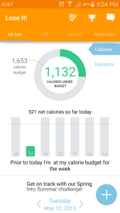
We are still not in Usability Nirvana, though. I don’t know the average age of the users of Lose It! app, but let’s hazard a guess if you are trying to lose weight you are probably not still in your twenties. Certainly this writer when he was in his twenties didn’t care about what he ate. Yet the menu font size indicates a demographic that doesn’t need reading glasses yet.
Bravo to the FitNow, the makers of Lose It!. I have lost weight using the app and its engaging, clean, crisp data visualization and gamification features – not to mention smart diet and exercise. The new feature of using the phone camera to photograph a barcode and get all the calories for 9 out of 10 prepared foods that I tried is a huge timesaver from tedious manual entry.
Losing weight with Lose It! wasn’t the real challenge.
The real challenge was how difficult it was to write this without any puns.
What do you think? Have you tried it or can you recommend other nutrition/exercise apps you love?
 Make it Pop