Japanese Kimono Painting (Watercolor on Paper)

Backstory

Last year, I produced a series of images in a theme loosely titled “Goddesses (Among Us)” and while they were all smaller (9 x 12″) I wanted to thematically continue the project – albeit larger. That was my mindset when embarking on this new Japanese kimono painting, so I went with 16 x 20″.

Furthermore, I was keen to complete this piece quickly. Larger paintings take an exponentially longer time to complete – for obvious reasons. The medium of watercolor does lends itself to staying loose; it is almost a quality of the pigment that working fast is beneficial. Overworking (or repairing) watercolor is very difficult, unlike the ease of the opaque mediums like oil paint.

Japanese Kimono Painting
Kimono I (2021)
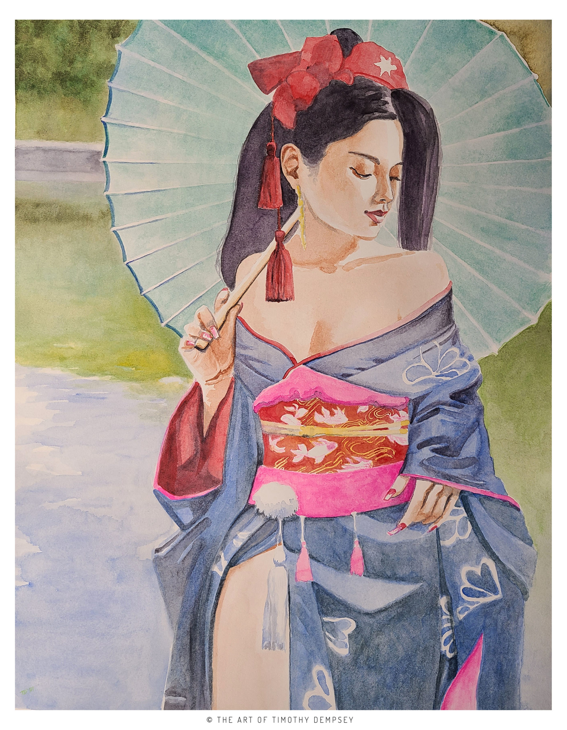
Watercolor on D’Arches 140 lb Hot Pressed Paper
16 X 20″

Most importantly, this piece was the first one created during my 30 day sabbatical from social media (Nov. 2021). It was a huge relief to be able to concentrate on art, not algorithms.

Inspiration

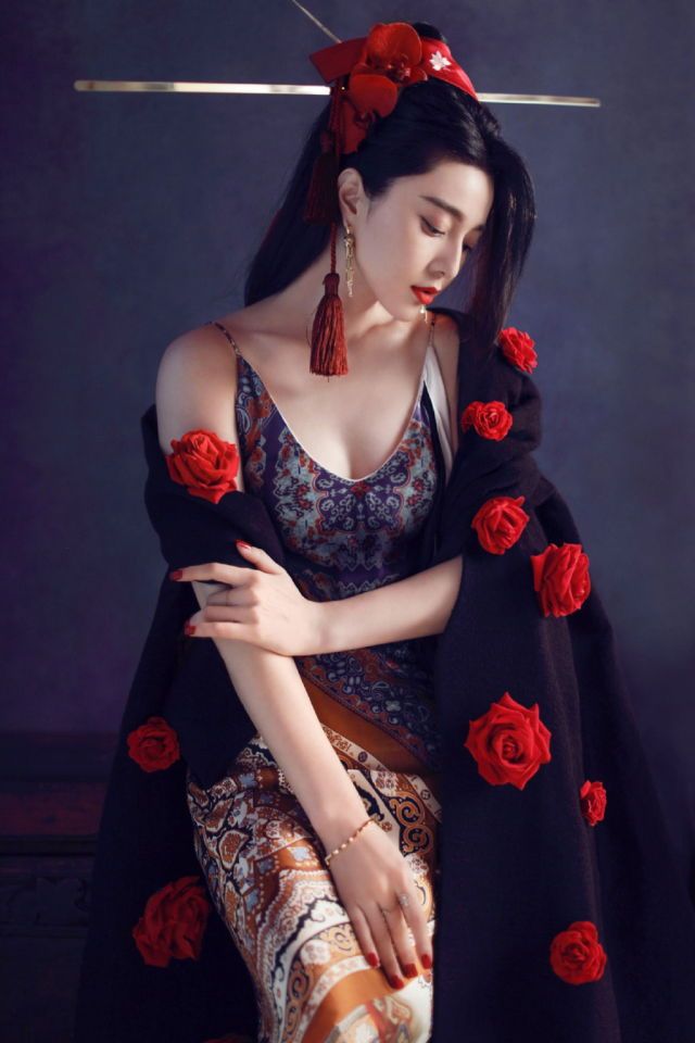
This Japanese kimono painting was derived from the two sources below. I tend to mash up at least two references to create a new, original work of art. I can clearly see that one reference leans towards cosplay, because historically the kimonos of Geisha are far more demure.

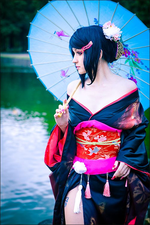
While I am exiting the social media platforms that are not “sparking joy” I must admit there are a small, select tools that I will always need to keep. This could be the topic of it’s own blog post. One of them is Pinterest, which is a great resource for saving and organizing inspiration.

Lessons Learned – Painting

  • I am experimenting with hot pressed paper. I have almost always used rougher, cold pressed paper but the tooth made it frustrating to paint crisp details. Life is too short to not experiment with paper!
  • I need to concentrate on comfort.
    While not really a lesson learned, the sedentary nature of my day job makes it undesirable to create artwork for long stretches while sitting. So, its a combination of ergonomics and new furniture to help me settle in for the long haul.
  • It is said that certain weights of watercolor paper need to be stretched in order to avoid cockling, or buckling. For this outing, I destroyed the first sheet (rather, repurposed into test scraps) since the process of deeply wetting the paper made it warble deeply. I was going for flat as possible.

Woodwork – Guitar Stand

Inspiration

Clutter. I can’t tolerate it. In my opinion nothing is more detrimental to the creative process than an untidy workspace. As James Brown said “Papa Don’t Take No Mess”.

I’ve been troubled lately that my guitars are all over the house. Some of them are where they belong, in the musical man cave where I spent a lot of free time. Some are in cases, some are in those singular ugly stands from music supply stores. Let’s organize my guitars for easy access, just like my tools!

I have seen a couple of plans, and the one that grabs me the most is a little beyond my current abilities and would be easier with the right tools. As I’m a power hand tool user, I thought that for this effort I should concentrate on using my corner clamps, which was a shortcut I took for my drink stand.

First Step: Assembling the Base

dempseystudio-woodworking-corner-clampsAnother portion of this outing is the choice of poplar. While pine would likely be softer, I wanted to venture into a different density of wood, like trying new canvas or paper for visual artists. Here is the assembled base with a closeup of the clamps.

dempseystudio-corner-clamps-closeupYou really need these if you are going to get into woodworking. Mine were a gift from my brother when he saw a stretched canvas that wasn’t “true”, but if lost or stolen I’d buy them again in a heartbeat. Required!

Assembling the Two Parts

Fender Stratocaster, trying out the new home

After a few hours of basic carpentry, the stand is functionally done. The next steps are ornamental, some might say optional – but I’ve already taken a few shortcuts – I feel compelled to add the suggested felt fabric in spots (most plans online call for carpet) and likely a quick coat of polyurethane. Not seeing a need to add stain, I want to bring this into use sooner rather than later.

The Fender Strat seems to like its new home pictured, but the first real wrinkle reared its head when my Fender Precision Bass was touching the floor in the cradle. Will have to improvise “feet” or find some ready-made on the shelves. I went with additional felt to cradle the instruments against the epoxy cement floor finish.

Lessons Learned

Not really a new lesson, but a recurring theme: these things take time! I rushed to synchronize the rare arrival of my new addition. There are plenty of rough edges and I could have put another week of finesse into this. Also, perhaps oil-based finish is the way to go. Even though water-based is easier to clean up, I used four coats of polyurethane and it is only a hint of the polish I wanted.

Finale

Tim Dempsey Woodworking - Guitar Stand
The finished piece, just in time for the new arrival: Gibson SG

If you’ve arrived here from Search and are interested in trying this, feel free to ask any questions. The point is that if I could do it, anyone can – but you should have at least the basic power tools. Below is a list of online plans from which I drew inspiration. My goal was to finish it in time for the arrival of the new addition to my arsenal (I hate to say “collection”, that implies I don’t play. I do.)

Here’s a list of inspiration:

It’s already full, so I will try another when I get another six guitars!

Please leave any comments below.  Thanks for reading.

Woodwork – Drink Stand

I have had aspirations of getting into woodworking for the longest time, and the time is upon me! This is partly owing to nearly forty years of making decorative visual arts and the nagging feeling that I’d like to branch into “creating something from nothing… that is useful.

Inspiration

Here is my first outing. A drink stand, if that’s even a thing. As I was sitting on my balcony (another work-in-progress post for another time), I realized I had nothing to put my drink on. I set out to be “inspired” by some existing ready-to-be-assembled designs and found this one online . It seemed an achievable first outing.

I knew my surface would be a pop of color, probably a reddish-earth terra cotta, which I found at Home Depot for the under $2USD. I didn’t look at the palette for the balcony design (yes I have one. Check it out on Pinterest), but I know neutrals and grays will work with this.

The Drawing Boarddrink-stand-end-table-summer-2016-tim-dempsey-dempseystudio

Maybe because I’m a glutton for punishment, I thought I should mock-up the plans in SketchUp. At the very least I could establish my own measurements. I haven’t looked at that app in years, it is apparently no longer a Google product but that doesn’t change what I want more than anything is at least an hour or two of professional SketchUp training. I digress.

First Cuts

20160611_181842As you see from the picture, these cuts are pretty basic. What I was going for was completing this piece in one day, I have since relaxed my ambitions to the extent that if it takes two days or spans two weekends, it’s better to do it right. As Teddy Roosevelt said “anything worth doing is worth doing well”.

woodwork-assemble-infrastructure-dempseystudio-2016Assembling the Base

I far underestimated the number of 1×1″ pine boards I would need. That’s a lie, I didn’t do the math at all, even with an app, because, well: math. I used a few smaller boards for the inner “I” bracing left over. I used wood screws and will graduate to counter-sink and hide the screw heads as time goes on. I went with an interior polyurethane I had laying around, even though this piece will be outdoors most of the time. So I’ll haul it in when inclement weather returns, or chalk it up to experience.

Finale

woodwork-drink-stand-dempseystudio2016I added the heavy paver stone and adhered it with Gorilla Glue and let it set overnight. Didn’t see a need for clamps due to the weight of the stone top. First time using this product so time will tell if it’s up to the task of gluing stone to wood.  If I had to do it all over again I would have used my corner clamps to make sure the I beam bracing in the bottom was squared-off all around. There truly are no shortcuts to doing a quality job.

While I may have spent 30 or 40 years learning how to make a painting in one day, woodworking is a whole new medium. As with anything, practice makes perfect.

So at last, here it is in place.


And the drink stand in action. That’s right, I spilled wine on it with the inaugural use. I knew I would. The social media debut of my first useful piece :

Thinking of Dad #tributetodad @wine_fix #wineoclock #cabernet @josephcarrwines #winefix #napavalley

A photo posted by Timothy Dempsey (@timothyadempsey) on

Woodwork Art – Fender

A rainy Sunday coincides nicely with a pressing need to create something with my own two hands. This quick little projects marries a few of my interests:

  • Woodworking
  • Music, in particular my love and patronage of the Fender Musical Instruments Corp., one of America’s most brilliant innovators.
  • and finally, painting

Admittedly the woodworking and painting are going to be as basic as possible to conceive and complete this in one day. Another key point is to use all materials at hand. I should have enough of the raw materials, art supplies and tools needed to avoid running out and buying more. Friday night at a rehearsal I consulted with a guitar expert about why the intonation of my Stratocaster is wildly unstable. This lead to ordering parts from Fender direct the next morning. So, a weekend of all things Fender.

Look at Pinterest and Etsy; you’ll see lots of examples of what I’m envisioning here. A few goals:

  1. Keep it simple
    By that I mean distressed, rough edges. Avoid the fussiness that sometimes creeps into my paintings. Okay, always creeps in.
  2. Be faithful to the logo. The lawyers may come after me, but fortunately I can draw free-hand.
  3. Execute what I see in my mind. My vision is red white and blue background to emphasize America. Fender’s best instruments are the American Series, even though in this age of austerity I am started to toy with buying second-hand made in Mexico products. Avoid the urge to Photoshop a mockup. The point is to use my hands to make something from nothing.

Step 1:

Basic Woodworking 101

I wanted the final piece to be about 11″x17″. Modestly-sized. Using a mitre saw, I cut 17″ lengths from spare deck boards in the garage. These are pressure-treated so they are more costly than what I’ll use going forward. There’s a big trend in reclaimed pallet wood, but recall I wanted to stay put and use materials on hand. I recently found myself moving these boards “out of the way”. This means they were “in the way”.

I know I wanted a gap, to allow some imperfection. I didn’t use my corner clamps which were given to me by my brother decades ago when he saw a canvas I stretched wasn’t “true” (he’s a machinist and skilled craftsmen). I’ll transition to that level of finesse when I setup my workshop. they are braced in the back by scrap 1″ x 1″.

Step 2:

Acrylic gesso, which is always laying around was quickly brushed in. Painting directly on the wood surface simply isn’t going to work. I intentionally scrubbed it in

Gesso, tracing logo onto support

quickly to allow wood to peak through. I transferred the logo sketch by simply placing it in the not-yet-dry gesso to score a reference shape. In fact, on a humid day the drying time of gesso is terribly slow, likely the reason I’m blogging. Like waiting for paint to dry. Literally.

Step 3:

Laying down the initial areas of color, it occurred to me to be too reminiscent with the flag of France and not American enough. Nothing against France (we may retire there) but it isn’t relevant to my Fender MIA (Made in America) tribute. It looks like I needed to add stars and stripes.

Step 4:

Something wasn't quite right. A few things, actually...
Something wasn’t quite right. A few things, actually…

After a few hours of work, I thought it was done. Something was not quite right, and I couldn’t put my finger on it so

That's more like it.
That’s more like it.

it was time to take a break and look at Pinterest boards. The problem was that it wasn’t perfect, but it was trying to be… I meant all along for it to look distressed. So, I took a deep breath and trotted out the electric sander to irreversibly mess it up somewhat.

Thanks for reading, if you have any questions please feel free to comment.

How to Guide Your User to the Primary Call to Action

blog-guide-eye-dempsey-linkedin-blog-2015-06-16-01

How to Guide Your User to the Primary Call to Action

There are a lot of sites that have reduced a call-to-action to a single button. In the past, my go-to, best of breed examples were Ebay and Amazon – but both reduced the call to action to one – Add to Cart. No “Cancels” to be found on either!

What do you do when a client’s page must have secondary – or even, multiple – call(s) to action? Guide the eye by establishing a hierarchy using size and color/value. Depicted here is a solution for a web-based system for a client that had nearly identical values for the blue and gray. (Flashback to color theory: value is the amount of “color” in a “color”, often called saturation).

Can you guess which action is primarily intended?

It is often helpful to apply the squint test – if you can squint and still parse the primary call-to-action, you are on the right track. For a deeper dive, there’s a new breed of online tools for testing contrast to ensure that Web Content Accessibility Guidelines (WCAG) are met.

For more reading on the topic, please check out http://conversionxl.com/everything-cta-size-location-color-works/

If you become more mindful of the call to action on the next site(s) you visit, or the next email opt-in in your Inbox, you will be better equipped to pitch the best practice to clients (and even devs).

A Look at Lose It! App While Avoiding all the Tempting Puns

Lose It! App

Lose It! App Review, Now with Fewer Puns!

A recent read on writing better blog post headlines dashed off the advice to use puns sparingly in post titles. That’s really a shame because today’s post is a review of the recent build of the great Lose It! app, and I like to think I’m good at bad puns.

In the free version of the Lose It! app, I have two pressing interactions during my peak (and sometimes sporadic) usage. One is to start the day recording my weight after getting off the bathroom scale first thing in the morning and the next is to log breakfast. As the day progresses I am able to count calories pretty accurately and see how my calorie-based goals measured up to my actual consumption.

These two separate tasks have been flattened into one. In one of life’s happy coincidences I have been asked for recommendations for books in the field of UX (and I am avidly reading a couple to blog about soon) but the bible of all is Don’t Make Me Think” by Steve Krug.

That was the problem with previous versions of Lose It!. I had to think too much. “I want to record my weight. Let me log my weight. No wait, not the “Log” menu. It’s a “Goal”, in the Goal menu. When I eat something, that’s when I log. Ugh. Too much thinking. Don’t make me think so much. I just got out of bed and haven’t even started the coffee yet.

Happily, in one of those downloads of app upgrades that you ignore on your smartphone as they are pushed (well, I ignore them), lo and behold it’s as if the makers of Lose It! performed card sorting on their app (available for years, at this point) and now it’s simply a trip to the Log menu or My Day for both recording today’s weight and counting calories, not to mention exercise.

Sure, it sounds like a first world problem if ever there was one, but in user centered design, a chief tenet is to involve your users. It seems FitBit clearly did. We can go on about our business and lives, because this app is twice as efficient now.Lose It! App

We are still not in Usability Nirvana, though. I don’t know the average age of the users of Lose It! app, but let’s hazard a guess if you are trying to lose weight you are probably not still in your twenties. Certainly this writer when he was in his twenties didn’t care about what he ate. Yet the menu font size indicates a demographic that doesn’t need reading glasses yet.

Bravo to the FitNow, the makers of Lose It!. I have lost weight using the app and its engaging, clean, crisp data visualization and gamification features – not to mention smart diet and exercise. The new feature of using the phone camera to photograph a barcode and get all the calories for 9 out of 10 prepared foods that I tried is a huge timesaver from tedious manual entry.

Losing weight with Lose It! wasn’t the real challenge.

The real challenge was how difficult it was to write this without any puns.

What do you think? Have you tried it or can you recommend other nutrition/exercise apps you love?


Why “Make it Pop (More)!” is the Best Creative Direction You’ll Get (or Give)

make-it-pop-finalMake it Pop

If you work in design, chances are that you have either been on the receiving end of this phrase – or maybe you have uttered it yourself.

Initially it can be greeted with skepticism (and either literal or internal eye-rolling, depending on the designer’s acting ability) from any designer in certain career stages. I have certainly scoffed at it myself.

But you know what? It’s the best creative direction you’ll hear because it is actionable. Sorry about the jargon-y word usage there, but stick with me.

What Designers Hear

They hear something akin to static-y white noise. It can often be a telltale sign of a person in a position of authority who lakes the ability to more descriptively “talk the talk”. But you know what? I realize lately that –

I Was Wrong. Or Cocky. Or Both.

Because – really – what the directive of “make it pop more” is trying to tell us can be traced to two prevailing design tenets: color usage and/or visual hierarchy.amazon

Visual design (at least for those paid practitioners in the working world) ought to lead the viewer to an action. Add to Cart. Contact Us. Opt-In with a Fake Email. The call to action is our  bread and butter. It’s success is inextricably  linked to whether or not we have achieved the business requirements of the piece.

Particularly in User Experience, visual hierarchy helps distinguish the desired primary action from the secondary action. Any doubt what these online stores want us to do next?

These  screenshots clearly illustrate the use of color to guide the user’s eye.Screen-Shot-2013-03-29-at-14.48.00

In both cases, the desired intent “pops”. You should be able to squint and still see the intended call to action whether it uses a color not used elsewhere or a button rendered with affordances like a shopping cart icon.

So, the next time someone asks you to “make it pop”, evaluate the color usage and size. And wipe that smirk off your face, unless of course you work off-site.


If You’re Not On Board with Font Awesome Icons Yet, You Should Be

If you are like me you may have heard of “Font Awesome” vector icons and decided you were too busy to look into it further. That’s really a shame, because I wish I wasn’t so “late to the party” on this advancement in #webdev.

What It Is

font-awesomeFont Awesome is a vector based set of icons accessed through CSS. The reason vector is import to us in the web world  is that a vector image can be scaled up or down without any loss of clarity, unlike bitmap (continuous tone) images. This versatility compared to continuous tone images is also a profound benefit to print design work.

It first came across my eyeballs as part of Twitter Bootstrap, but I didn’t have the time to drill down into what it was… or…

Why It Is… Awesome

Pros

The day I finally got “on board”, I spent some time cleaning up compression artifacts in one of the social media icons I used for Twitter. This is not fun. At that moment I realized the images also wouldn’t scale well in a responsive page, and a light bulb icon went off over my head, reminding me of Font Awesome.

Let’s not forget: open source; completely free.

Cons

The drawback for any assets that use a CDN (content delivery network) is that lag could be introduced when fetching your content. I saw this a lot with a Yahoo Weather service I was using frequently that would not execute at all sometimes. For sites with low-to-moderate traffic, this may not be a worry until you are working with high-traffic sites that fetch multiple sources of syndicated content on other web servers.

Finally, I find they look best in gray for my branding. While they can be colored using CSS to match the particular palette of the social media brand in question, I now need to go back and adjust my branding on all my social media page headers for the new grayscale approach (see portfolio), but it’s worth it.

What do you think? Have you “seen the light” about Font Awesome icons?


The Pros and Cons of Legacy MIDI Music Gear

For bedroom composers and aspiring producers all over the world, the online marketplace has made it possible to add second-hand legacy MIDI music gear to our arsenals “for a song”. There is an upside and a downside to this revolution made possible mostly by eBay and Craigslist – not to mention Harmony Central before them.

Pros

The upside is price, or rather the savings. Hardware synths circa 2003 from the major manufacturers (Roland, Yamaha and Korg) can be scored for 25% of their retail prices when they were new. Some sounds are subject to being dated, but for the most part they still sound amazing. My preference is for 128 voice synths exclusively from here on.

Cons

The downside is USB support and development, or rather the cessation of development. While the MIDI specification is over thirty years old and not going anywhere, more ports and advanced features are available only with USB, like sample loading to hardware synths from your computer. I spent hours wrestling with a driver for Windows 8 to learn from Roland’s site that Windows 8.1 for the Fantom-XR is no longer supported.

I can only speculate why support would stop: allocating resources to support new OS versions of USB on legacy hardware devices isn’t practical. Manufacturers have an interest in selling their latest models at full MSRP prices.

This lack of support caused me to do the unthinkable when Yamaha returned a TG-55 that failed as “no longer supported”. I was willing to pay for repair for this workhorse; the unthinkable act was that it went out in the trash.

Workarounddempseystudio-music-MIDI

If you have the opportunity to trot out some older computers to pair with legacy music hardware, this is a route to take. In my case a circa 2003 Mac Powerbook fits the bill nicely. This did the trick when I was eager to explore drag-and-drop audio files for the sampling feature of Roland’s Fantom XR, my latest addition (and believe me, it was far from a drag-and-drop workflow but that may be the topic of another post).

To their credit, the big three manufacturers almost always keep legacy drivers available for an older OS like Mac 10.4. If this is not an option, the appeal of the savings on legacy gear is diminished. While still viable due to the MIDI standard, the advanced features and multiple ports available via USB are not available if your new OS isn’t supported any longer.

CMS Deuce: WordPress and Drupal

For more than ten years, two of the leading leading content management systems (CMS) have been making quite a racket. Sorry about that.

I’d like to weigh in on the two top contenders: WordPress and Drupal. For clarity’s sake I’m only considering the self-hosted WordPress platform, not the wordpress.com hosted option.

The conventional wisdom is that WordPress is a better choice for new users, while Drupal is more powerful but comes with a steep learning curve. Both are open-source (free) so there really is no barrier to entry from a financial side if you are inclined towards tire-kicking either – or both.

I have over six years of personal hands-on experience with WordPress using it almost daily, five of those hosting my own independent webcomic from 2009-2014. That comfort level steered me to recommend and implement the platform for dempsey-doodles-blog-wordpress-drupal-deuce-tennistwo sites for my last employer. An intranet and a portfolio site for the custom builds division of an events organizer firm.

  • Downloads
    There really is no competition when it comes to downloads and installed sites. Created by Matt Mullenweg, WordPress beats the options handily by a factor of ten. It’s what I am using as I type this, so you could say I’m a brand advocate.
    Advantage: WordPress
  • Multi user site(s)
    WordPress has folded in a formerly different product WordPress Multi User (MU) into later versions of the WordPress core. It was very simple to add Subscribers to the intranet and train two staff to be Editors, ultimately moving an HR person into my former Administator role. Any computer-literate professional in the work force can publish or maintain a WordPress site once it is built. Drupal has the ability to fine tune toolbars and limit the visibility of certain site sections to certain users, but it feels like you are “rolling your own”.
    Advantage: WordPress
  • Blocks
    The terminology of Blocks is not one that I love so much, but rather the feature of highlighting the Blocks (via the somewhat clumsily worded  “Demonstrate block regions”) that I find to be a great visual aid, particularly if you aren’t familiar with a theme or have taken over someone else’s site. I’d like to see this adopted as a convention in browsers. I know the beloved Firefox Web Developer add-in can show DIVs, but the implementation is clunky and cluttered.
    Advantage: Drupal.
  • Themes
    For my upcoming Drupal site, a gallery of sketch cards (you can have a sneak peak here), I bought a great premium template from Themeforest, the leading resource for both WordPress and Drupal themes. Since there are fewer Drupal installations, there is a related dearth of portfolio type themes, but I found one I love. In the WordPress world, the third-party options abound and make it hard to decide. With fewer choices,  I’m paradoxically giving this
    Advantage: Drupal.

So, we have a CMS deuce, and it isn’t even tennis season! After starting this post I found a great round-up which adds Joomla! to the game, explained in  concise terms with tables and graphics and pull quotes. Read it here.

What do you think? Agree or disagree? Please leave a comment.

Related Tweeting